Choosing the right logo design is crucial for any business. However, for small businesses, it can be challenging to determine the best choice and understand the available options.
What Type of Logo Design Do I Need?
Choosing the Right Logo Design
For Your Small Business
Are you asking yourself : What type of Logo Design do I need for my small business? Choosing the right logo design is crucial for any business, but can be overwhelming! However, for small businesses, it can be challenging to determine the best choice and understand the available options.
Investing in a logo can often be a significant expense, leading some to cut corners initially. Unfortunately, this can result in needing to redesign the logo later, incurring additional costs. Worse yet, you might end up stuck with a logo you hate that doesn’t grow with your business or something generic that you see everywhere else.
Your logo is the face of your brand. It shows your values, style, and what your business is all about at a glance. But with so many types of logos, how do you choose the right one? Let’s look at the different types of logo designs to help you decide.
1. Wordmark Logos
What are they?
Wordmark logos are text-only logos that focus on your business name. They use distinct typography to create a unique look.
Best for:
- Businesses with unique or catchy names.
- Establishing brand name recognition.
Examples:
- Coca-Cola
- Disney
- FedEx
- Netflix
Why choose it?
If your business name is distinctive and you want to emphasise it, a wordmark is perfect. It’s straightforward and ensures your name is the central focus, making it easier for people to remember.
2. Lettermark Logos
What are they?
A lettermark is a logo that’s made up of a few letters, usually a company’s initials, without any imagery. Lettermark logos, or monogram logos, use initials to represent the brand. They are great for simplifying long business names. The lettermark logo is all about simplicity.
Best for:
- Businesses with lengthy names.
- Creating a sleek, minimalist look.
Examples:
- AOL – Americans On Line
- EA – Electronic Arts
- WB – Warner Bros
- HP – Hewlett Packard
- BBC – British Broadcasting Corporation
- ESPN -Entertainment and Sports Programming Network

Why choose it?
If your business name is long or complex, a lettermark can simplify it and make it more memorable. This type of logo also works well if your initials are easily recognisable or form a visually appealing design.
3. Icon or Symbol Logos
What are they?
These logos rely on a graphic symbol or icon to represent the business, either alone or alongside the business name. They generally don’t feature any text or letterforms.
Best for:
Established brands.
Businesses with strong brand identity.
Examples:
- Apple
- Spotify
- Olympic Games
- Target
- Nike

Why choose it?
An icon or symbol logo can be powerful if you want a visual element that stands alone. This type of logo is versatile and can be easily recognised, even without accompanying text.
4. Combination Logos
What are they?
Combination logos integrate both text (wordmark or lettermark) and a symbol or icon.
Best for:
Businesses wanting flexibility.
Enhancing brand recognition through text and imagery
Examples:
- Airbnb
- Puma
- Spaceking Productions
- Business on the Border
- Tale Marketing Agency
- Sahara Studio

Why choose it?
Combination logos offer the best of both worlds. They provide flexibility in branding, as you can use the text or icon independently, depending on the context. This versatility can be particularly useful for different applications, such as website headers, business cards, or social media.
5. Emblem Logos
What are they?
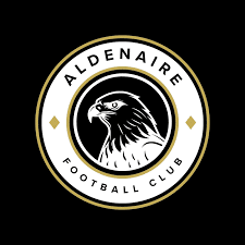
Emblem logos consist of text within a symbol or icon, often resembling badges or seals.
Best for:
- Traditional or vintage brands.
- Conveying a sense of heritage or authority.
Examples:
- Liverpool Foot Ball Club
- Harley Davidson Motorcycles
- Starbucks
- Harry Potter School Emblem
- Alfa Romeo
Why choose it?
If you want to convey a sense of tradition, reliability, or formality, an emblem logo is an excellent choice. It’s also a great way to incorporate intricate designs and detailed elements that can tell a story about your brand.
Which Type of Logo Is Most Popular?
At Sahara Studio Combination Logos are what most businesses ask for because they offer the best of both worlds.
They are the most future-proof because each element of the text components and icon are provided independently and then presented as Master Logo, Secondary Logos, Stacked combinations, and Icons and delivered with complete file breakdowns, covering every possible need for print + digital.
Let’s look at some examples from the Feminine Connection: 1-6 from Left to Right – 1. Master Logo, 2. Secondary Logo 1, 3. Secondary Logo 2, 4. Secondary Logo Text Only, 5. Logo Mark, and finally 6. Master Logo, text only.


Can I Combine Different Types of Logos?
Absolutely! You can combine different logos. My job is to ensure your requests are included in all designs. I make sure they work well together for a consistent brand image and are functional for various uses. This way, your investment in your brand lasts long and fits all the applications you need.
1. Logo Redesign
A significant redesign or a complete overhaul of the logo.
- Changing the logo’s colour scheme, icon, typography, or overall design.
- Major transformation that can alter brand perception.
Example: Iglooze Dome Hire Sydney was a completed redesign. The only element from the old logo they liked was the Igloo concept, which was kept but it that was the only resemblance in the entire redesign
2. Logo Refresh
Minor adjustments or refinements to the existing logo.
- Adjusting font size, slightly altering colours, or refining the logo’s shape. The impact is subtle and the tweaks stay within the original brand keeping continuity while improving the design.
Overcomplicating the Design:
This is where the KISS principle applies (Keep It Simple Stupid). Overcomplicating a design happens when you add too many elements, colours, or intricate details.
A busy design can be hard to recognise and remember. Who is your client? If your business is an optometrist and your logo is overly detailed and too small, your ideal client isn’t going to see it, or even identify with it. Simple logos are more versatile and easily identifiable
Using Generic Elements:
Relying on clichés or common symbols, such as lightbulbs for ideas or globes for international businesses. Also using generic elements on various logo platforms will not be original, and may even be used by your competitors, and there will be nothing you can do about it because these platforms specifically state you can not copyright or trademark any design you use from their software (ie Canva).
Generic logos fail to stand out and can make your brand look unoriginal or uninspired and are easily confused with other brands. This is not to say some less reputable designers are doing the same thing. Read your contract and ask questions.
Poor Font Choice
Choosing fonts that are hard to read, overly trendy, or don’t match the brand’s tone.
Or using fonts that are too small, too big, there are too many kinds of fonts in the design, they use script fonts that look pretty, but most people can’t read. There are a range of factors with fonts people miss.
Typography is crucial for establishing the personality and perception of a brand. Certain types of fonts can convey whether a brand exudes luxury, speed, or a variety of other attributes. The choice of typography impacts how customers perceive and interact with the brand’s identity
Inadequate Colour Consideration
Selecting colours without considering how they work together or what they represent. Colour is important but with colour comes contrast! Contrasting colour with typography is essential for you to stand out and get attention.
Colours evoke emotions and associations. Poor colour choices can send the wrong message or fail to create the desired impact, especially when you’re looking at shades of taupe!
Copying Competitors
Imitating the logos of other businesses in the same industry.
Copying can lead to legal issues and fails to create a unique identity for your brand. It can also confuse customers.
Lack of Versatility
Designing a logo that doesn’t scale well or looks bad in different formats (print, digital, monochrome, etc.). That’s why we provide such a detailed logo design package to make sure that you are not wondering 12 months later why you don’t have the exact file you need. Our Logo’s are provided in:
- Full Colour
- Black On White
- White On Black
- Black on transparent
- White on transparent
- Grayscale
- Colours within your branding.
- And we do this for every variation of your logo.
A good logo should be adaptable to various sizes and mediums. It needs to be recognisable whether it’s on a business card or a billboard.
Failing to Future-Proof
Designing a logo that’s too trendy or not considering how it will age. If a current trend isn’t going to work with your business, then don’t pursue it. A good designer will look at whats in the marketplace for your direct competition so that you aren’t looking like every Tom Dick and Harry in your business section.
Trends change, but a good logo should last. A timeless design avoids the need for frequent rebranding and maintains consistency over time.
Avoiding these common mistakes can help ensure that your logo effectively represents your brand and stands the test of time. If you need help crafting the perfect logo, Sahara Studio is here to assist!
If your confused or need a logo design, book a time for a chat.
More Insights
A Case Study in Branding
Laura Scott, a respected neuropsychologist based in Victoria, Australia, approached me with a unique challenge. She needed a cohesive branding identity that could effectively communicate to both the professional legal industry, where she presented reports, and her clients, many of whom suffered from brain injuries.
What Are The Different Types of SEO?
What Are the Different Types of SEO? When we build a website, the whole purpose is so people know who we are, what we do,
Do I need a multi or single page website for the best SEO?
Do I need a multi or single page website for the best SEO? Do I need a multi or single page website for the best
