Business on the Border
brand + Logo Design
Client Love
Wow, just Wow. I didn’t even give you that much of a brief and you hit it out of the park the first time. The level of professionalism in the delivery of the files and the branding guide that you have shown, I have never had that before. That’s just amazing.
A primary logo is the cornerstone of your brand identity, but having variations allows you to maintain consistency while accommodating different sizes, backgrounds, and mediums.
Flexibility
A secondary logo, along with alternative versions like a horizontal or stacked layout, provides flexibility for different applications. Whether it’s a social media profile picture, a website header, or a promotional banner, having options ensures your logo looks its best in any situation.
Adaptability
Not all platforms or materials are created equal. A simplified version of your logo might be necessary for small-scale printing or embroidery, while a full-colour version might shine on digital platforms. By including variations, you’re prepared for any scenario.
Memorability
Offering variations can enhance brand recognition. When customers encounter your logo in different contexts but consistently styled, it reinforces your brand identity and makes it more memorable.
Professionalism
Providing a comprehensive logo package demonstrates professionalism and attention to detail. It shows that you’re committed to presenting your brand in the best possible light across all touchpoints

MASTER LOGO
MASTER LOGO
SECONDARY LOGO
LOGO VARIATIONS
A master logo, secondary logo or logo mark comes from a business purpose and how it will be presented to the public.
THE LOGO MARK
Behind every logo is careful consideration of the logo mark, what it represents and how it conveys its purpose to its potential client base.
THE PODCAST
Business on the Border Podcast was designed with the purpose of unifying businesses that lie on the border of New South Wales and Victorian towns commonly referred to as Albury Wodonga.
TWIN CITIES
Albury is in New South Wales while Wodonga is in Victoria. Albury Wodonga are considered twin cities that are separated geographically by the Murray River, but politically are governed by different state bodies.
According to Google “as of 2023, the Albury-Wodonga website describes it as having a combined population of around 100,000 residents and being Australia’s 20th largest city” despite the fact they are considered uniquely distinct cities in completely different states.

Letter B

The b letter symbolises
the shape of the headphones that a person is wearing while listening to the podcast.
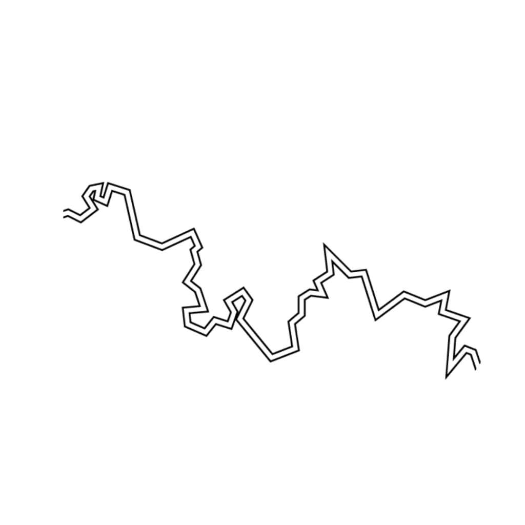
Double Lines

The double lines represent two borders, as in each side of the border. This was taken from Google maps and adapted for the logo.
line break

The bowl of the b is broken symbolising :
1. The break in the border represents difficulties in doing business across the physical border … and
2. The distinct size of the states between NSW + Victoria

